
Brand Strategy • Visual identity • Brand Guidelines • Creative Direction
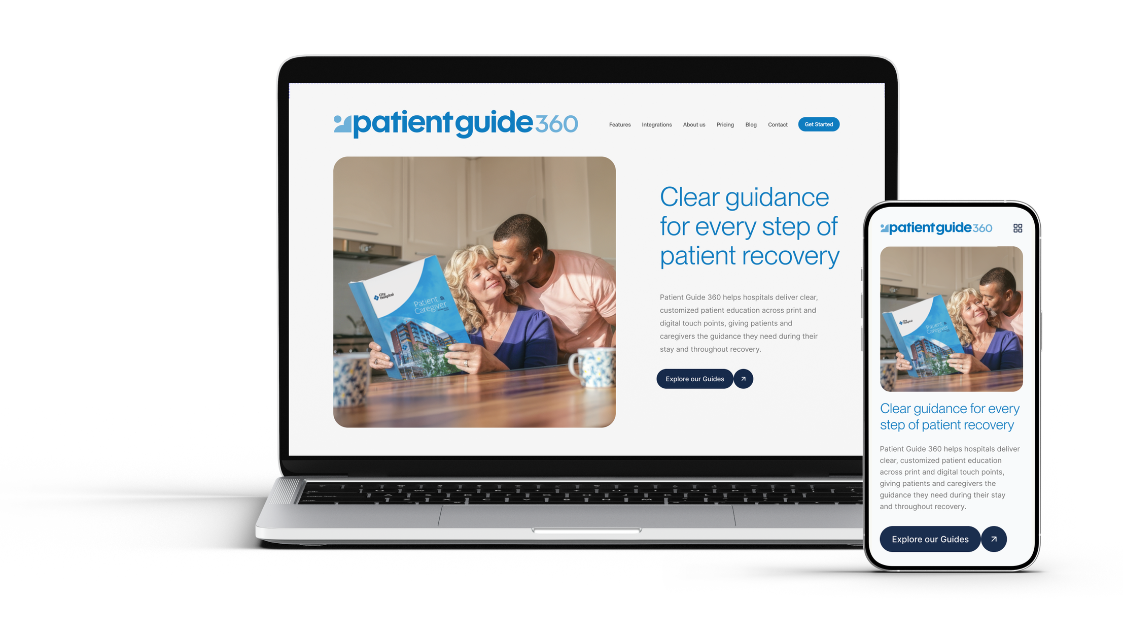
A clearer identity for patient education.
Evolving Patient Guide Solutions into Patient Guide 360: an approachable brand system built to connect across digital, print, and the moments in between.
PROJECT
Patient Guide Solutions rebranded to become
Patient Guide 360
MY ROLE
Brand audit, naming, creative direction,
visual identity, and brand guidelines
SCOPE
Implemented palette and illustration updates.
Proposed PG360 identity and applications.
One mark, four ideas.
PGS exists to support patients through one of the hardest times in their lives. The mark carries that purpose in its form: the patient, held by guidance, care and heart.
01 The patient
Read one way, it's a person: the patient every guide is written for.
02 The guide
Read the other way, it's an open book, the guide standing beside them.
03 A heart
The same curve is a heart, for the empathy behind the work.
04 A cross
Rotate it four times around a center and a cross appears.
Visual identity
A system with room to grow.
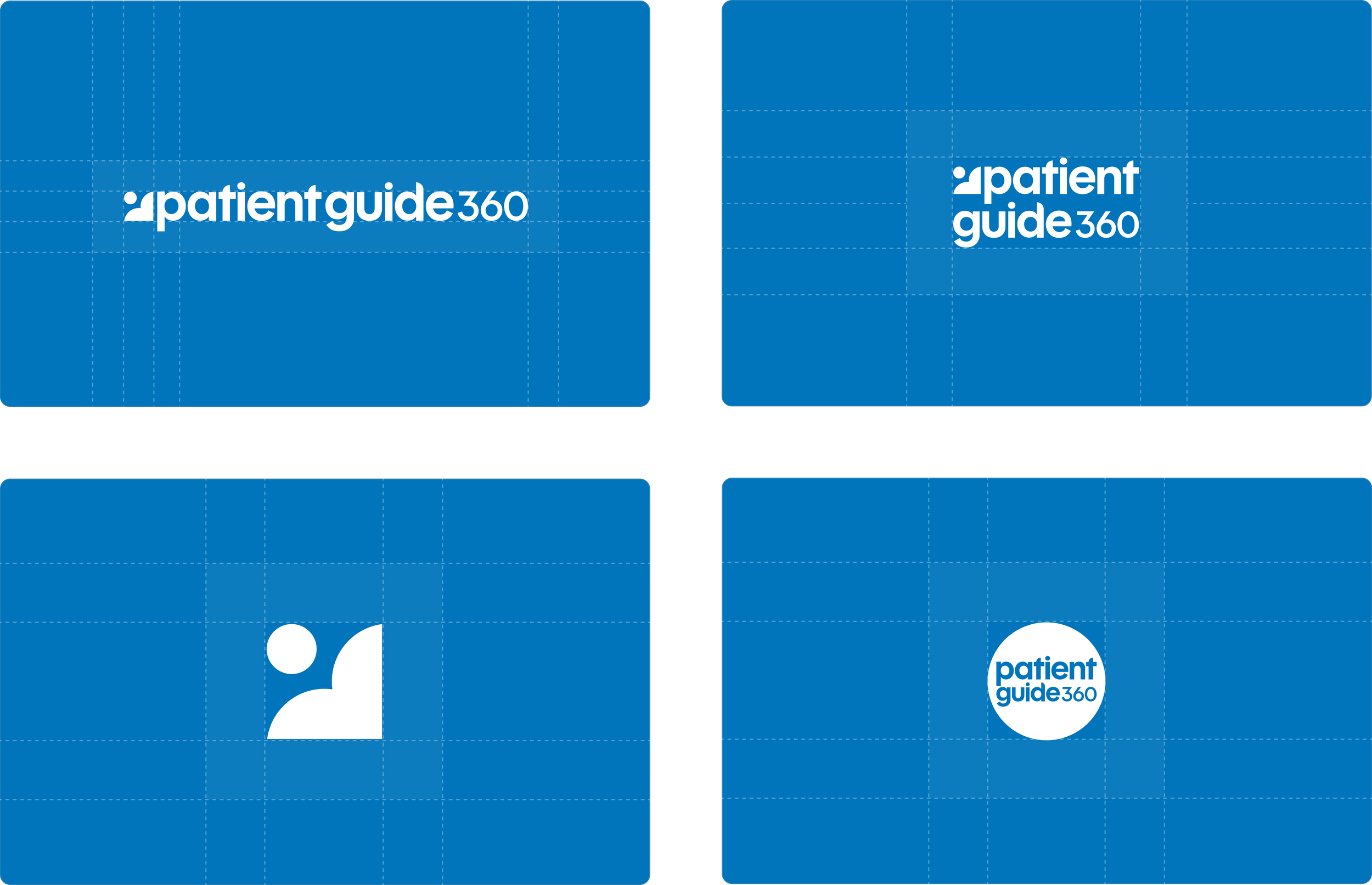
Logo system
Built to work at any size.
A standalone mark, horizontal and stacked lockups, and a circle badge give the brand a version for every space. Solid shapes and set clear-space rules keep it readable from a 16-pixel favicon to a booth banner.
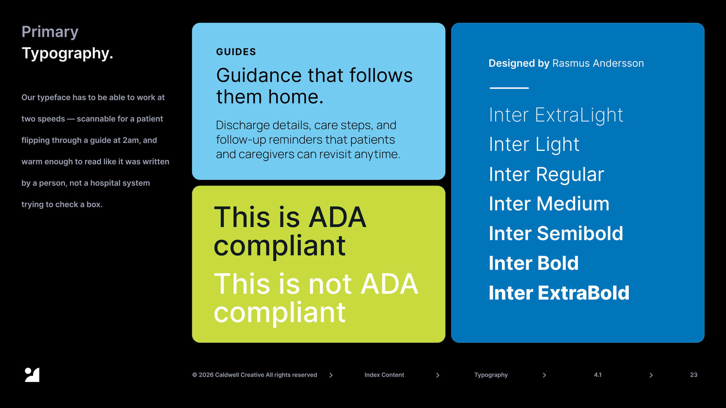
Typography
Easy to read on the hardest days.
Patients often read our guides tired, anxious or in pain, and many are older adults. Inter's tall lowercase letters and open shapes stay clear at small sizes, in print and on screen. Paired with plain-language writing developed with medical professionals, the type does its job: it gets out of the way so the information gets through.
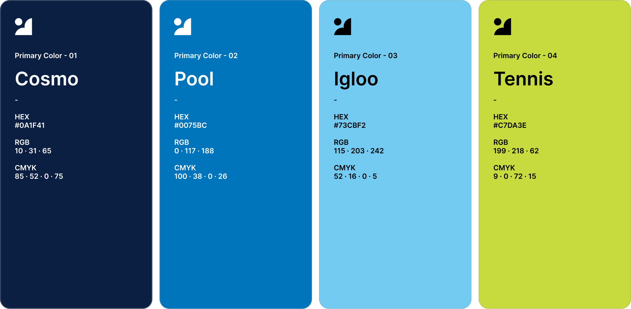
Color
Accessible by default.
A confident blue palette that stays calm enough for a hospital room and clear enough to read under stress. Every text pairing is contrast-tested and documented, including the ones never to use.
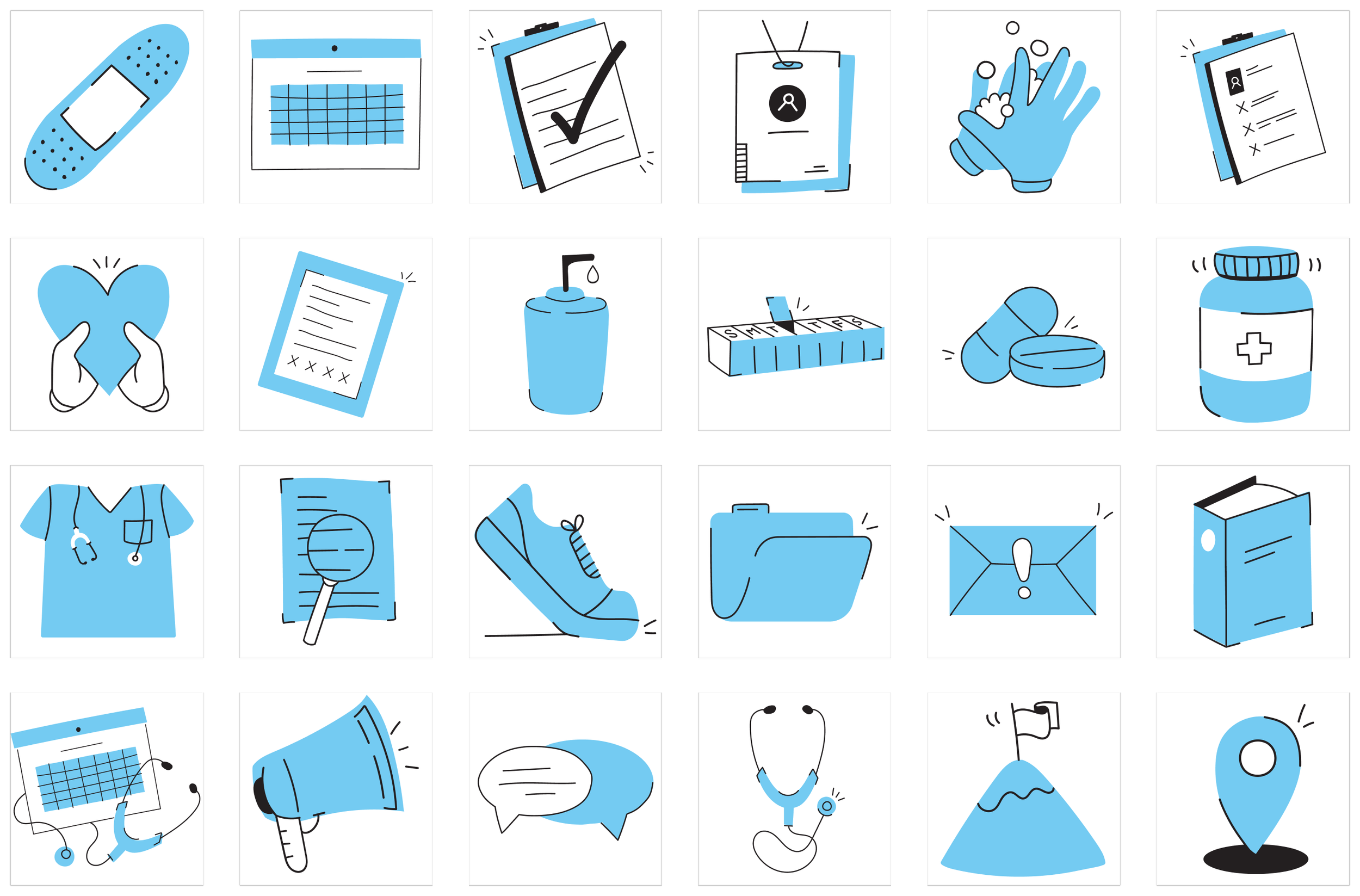
Illustration • Implemented
Drawn by hand, built for care.
A custom set of hand-drawn icons replaced flat stock graphics. Loose linework and a single Igloo fill give guides and marketing a warmer, more human voice.
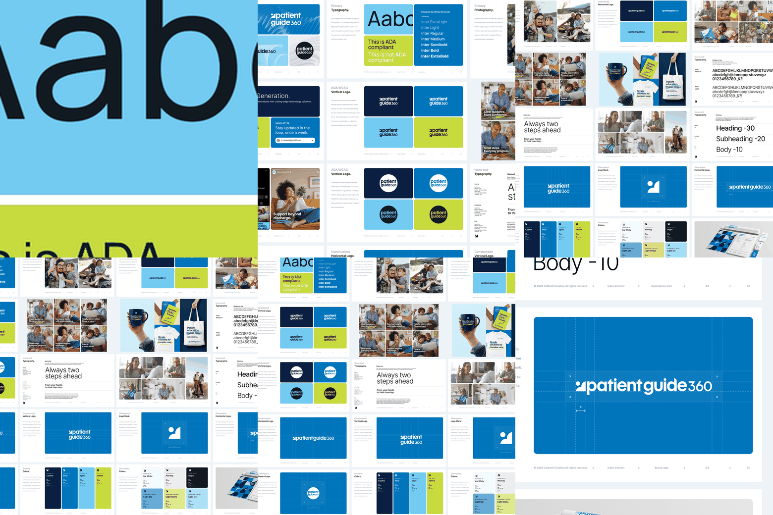
Brand guidelines
The brand's first rulebook.
PGS had a logo but no brand guidelines, so everyone who touched the brand made it up as they went. Colors drifted, fonts changed and our buttons failed accessibility standards.
I built the company's first brand guidelines so anyone could get it right:
One look everywhere. Logo, color, type and imagery rules for every channel.
Accessible by default. Every color pairing tested, including the ones to never use.
One voice. Clear messaging and tone, no matter who's writing.
Faster approvals. Clear standards replace personal preference, so teams stop redoing work.
Ready to grow. New hires, agencies and partners can represent the brand from day one.
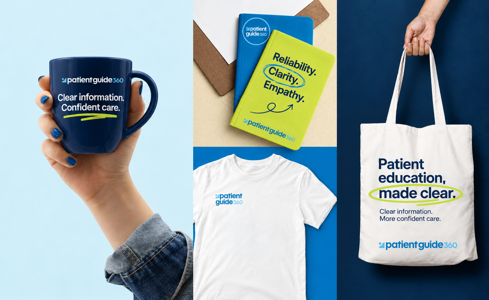
Brand experience • Implemented
A thank-you they'll actually keep.
I wanted the brand to feel as caring in person as it does on the page. I introduced a warmer gifting and merch program for prospective clients and hospital staff: mugs, notebooks, shirts and totes people actually use, plus fun giveaways for events. It launched with the refreshed palette and original logo; shown here with the proposed PG360 identity.
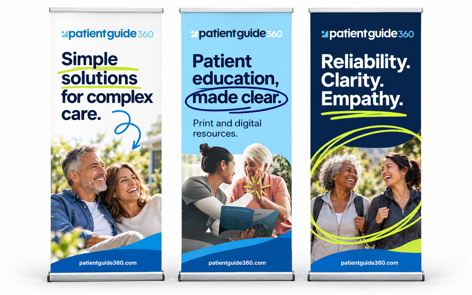
Events • Implemented
A consistent presence beyond the screen.
At a conference, the brand gets seconds to be noticed. The banner series pairs short, confident headlines with real patient moments and the same hand-drawn accents, so every panel reads as one standout brand.
The challenge
A growing company with a brand that stayed small.
Patient Guide Solutions had grown from a single print product into a library of medically specified guides, a digital patient resource library, and a platform for hospital-branded digital products.
The identity hadn't grown with it.
Two audiences, one brand. Hospital decision-makers buy the product: board members, marketing and patient-experience leaders. Patients and caregivers use it. The brand had to earn trust with buyers without losing sight of the patient.
A brand that works in the background. Every guide carries the hospital's brand, not PGS's. The company gets only a few moments to be seen, in sales calls, at events, in email and online, and the old identity blended into a sea of generic healthcare logos.
The Patient Guide Solutions brief: Position PGS as a patient-education partner, not a print vendor, with a name and identity that explain the offering, unite the product family and stand out when the brand is seen.
The starting point
Making a new brand work harder.
One Logo, One Direction
The original identity was a single thin, horizontal wordmark that had to do every job. Its hairline "SOLUTIONS" disappeared at small sizes and in engraving, the dotted arc was decorative rather than meaningful, and there was no compact mark for favicons, social avatars or merch.
AUDIT BEFORE ACTION
A year after the company invested in a new identity, I joined as Creative Director in 2024. Before proposing anything, I audited how the brand performed where it mattered most: in front of hospital buyers, patients and caregivers, across every color, lockup, template and touchpoint.
RISK SURFACED
The audit surfaced two risks a brand can't afford in healthcare. Core color pairings, including every call-to-action button, failed WCAG contrast standards. And the logo's hairline details broke down in production: on engraved Stanley tumblers, our signature client gift, "SOLUTIONS" vanished.
THE FIX
I prioritized the fixes that would protect the brand fastest: an accessible palette and a warmer, hand-drawn illustration system, both implemented within the existing identity. Every remaining finding became the strategic foundation for a new direction: Patient Guide 360.
The original identity
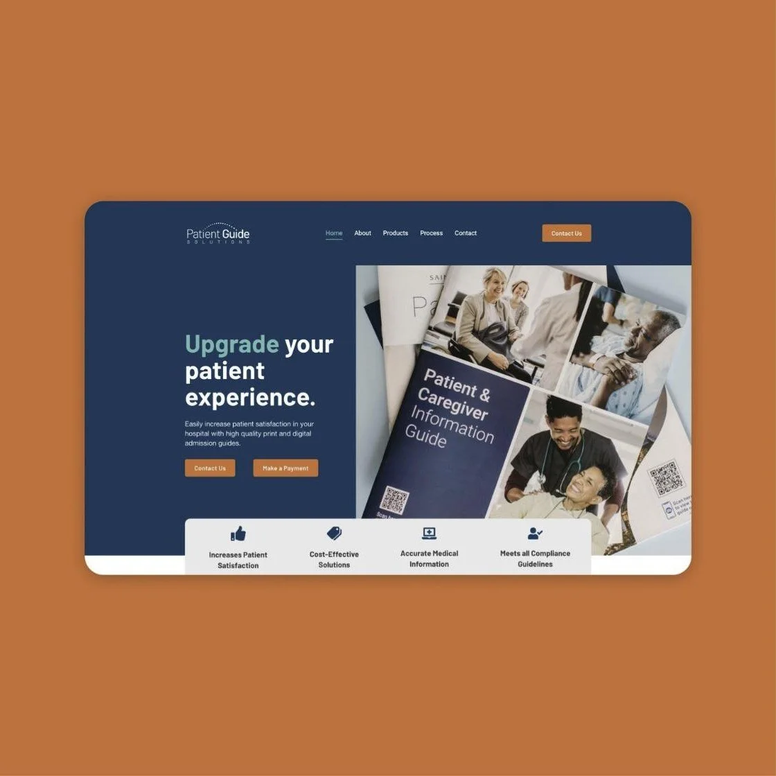
Where the original identity fell short
The most important button was the hardest to read.
The homepage made the brand's most important action its least readable. White text on the orange call-to-action buttons measured 3.1 : 1, well below the 4.5 : 1 WCAG minimum. For a company selling to hospitals, where accessibility is expected, the first impression undercut the message.
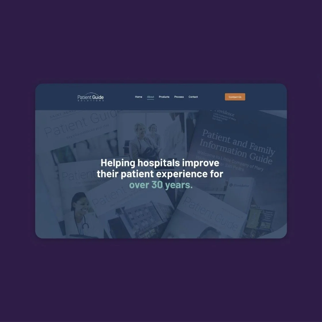
Logo performance
One wordmark doing every job.
One horizontal wordmark had to carry every application. At navigation size, the hairline "SOLUTIONS" and the dotted arc nearly vanish, and there was no compact mark for favicons, social avatars or merch. Without a system of lockups, the brand had nowhere to go when space got tight.
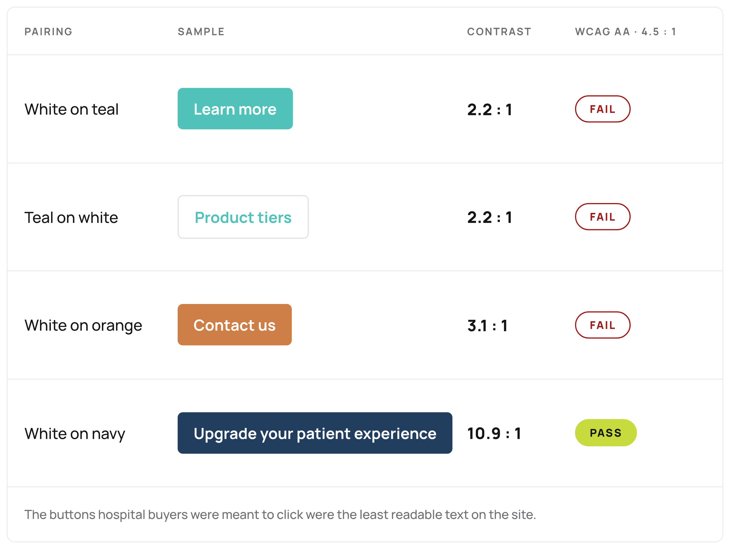
Accessibility audit
Making the case with numbers.
The audit put numbers behind what the eye already saw. Of the brand's most-used text pairings, only white on navy passed WCAG AA. Teal, the signature color, failed both ways. Documenting it made the case objective, not a matter of taste, and the palette became the first fix approved.
Direction
Clarity, with a human touch.
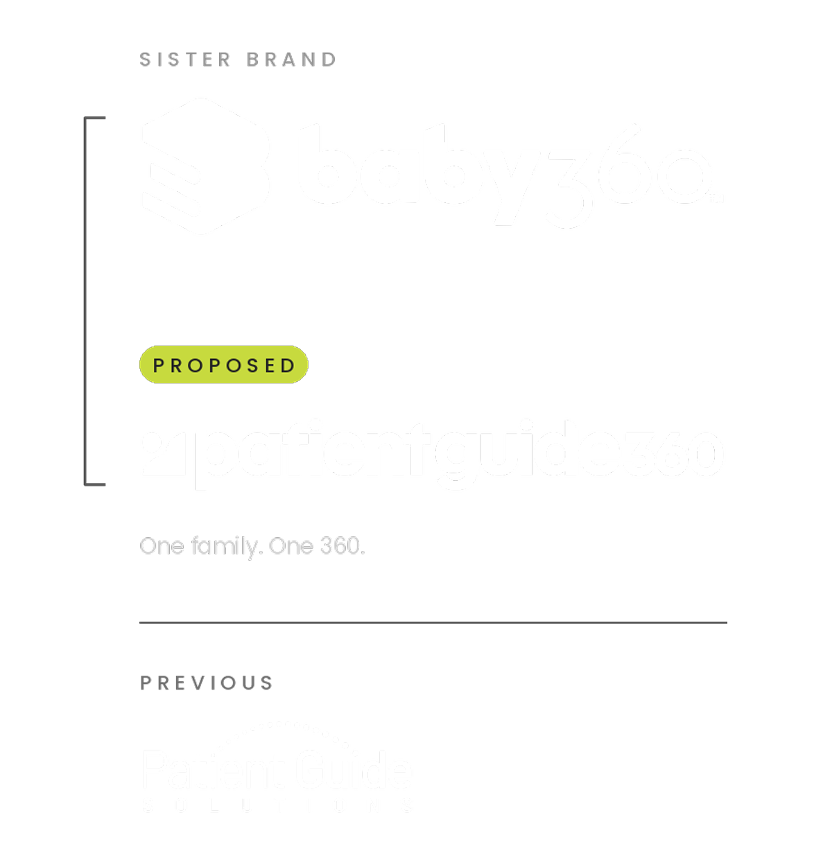
Patient education needs to feel understandable and approachable. The brand behind it should reflect those same qualities.
Patient Guide 360 brings everything I learned into one identity, and the name does two things. It connects us to our sister company, Baby360, so the family finally looks like a family. And it says what we believe: patient education doesn't end at discharge. It comes full circle, from the first appointment through recovery at home.
The outcome • Implemented
From clinical and cold to warm and hopeful.
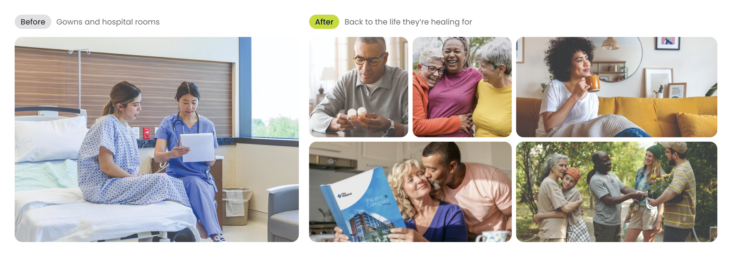
Picturing life after the hospital.
The old photography showed patients where they were: in gowns, in hospital rooms. I wanted our brand to show them where they're going. I moved our guides, marketing and website to lifestyle photography: people at home, outdoors and back with the people they love.
It's a small shift with a real effect. A guide that feels hopeful is one patients want to open, and it keeps them focused on getting back to their life. That's what 360 means to me: care that doesn't stop at discharge, but comes full circle.