Digital expression · Proposed application
A clearer introduction
for hospital partners.
The website concept brings the identity into a focused B2B experience: who the company serves, what it provides, and how its resources support patients throughout recovery.
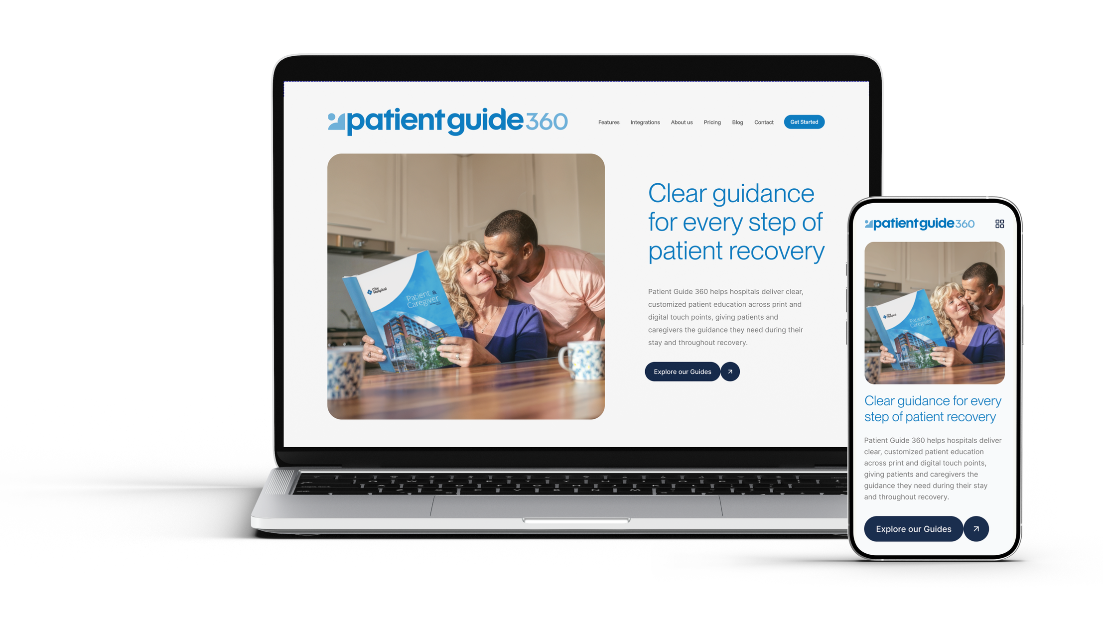
Brand Strategy • Visual identity • Brand Guidelines • Creative Direction
A clearer identity for patient education.
Evolving Patient Guide Solutions into Patient Guide 360: an approachable brand system built to connect across digital, print, and the moments in between.
PROJECT
Patient Guide Solutions rebranded to become
Patient Guide 360
MY ROLE
Brand audit, naming, creative direction,
visual identity, and brand guidelines
SCOPE
Implemented palette and illustration updates.
Proposed PG360 identity and applications.
The meaning behind the mark
The PG360 symbol brings together four ideas: the patient, an open book for guidance, a heart for empathy, and a cross for healthcare. I created this animation to reveal those connections, showing how the icon expresses the purpose of the brand through a simple, connected visual language.
The Direction
Clarity, with
a human touch.

Patient education needs to feel understandable and approachable. The brand behind it should reflect those same qualities.
When I joined Patient Guide Solutions as Creative Director in 2024, I began by auditing the existing identity. I introduced color and illustration updates within the established brand, then developed a proposed next phase: Patient Guide 360.
The shorter name connects the brand to sister company Baby360. The identity brings that connection into a flexible system for communicating with hospitals while keeping patients and caregivers at its heart.
A system with room to grow.
The old brand had one logo file. PG360 has a system.
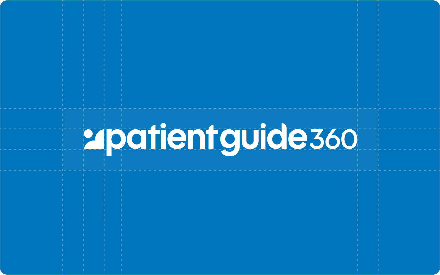
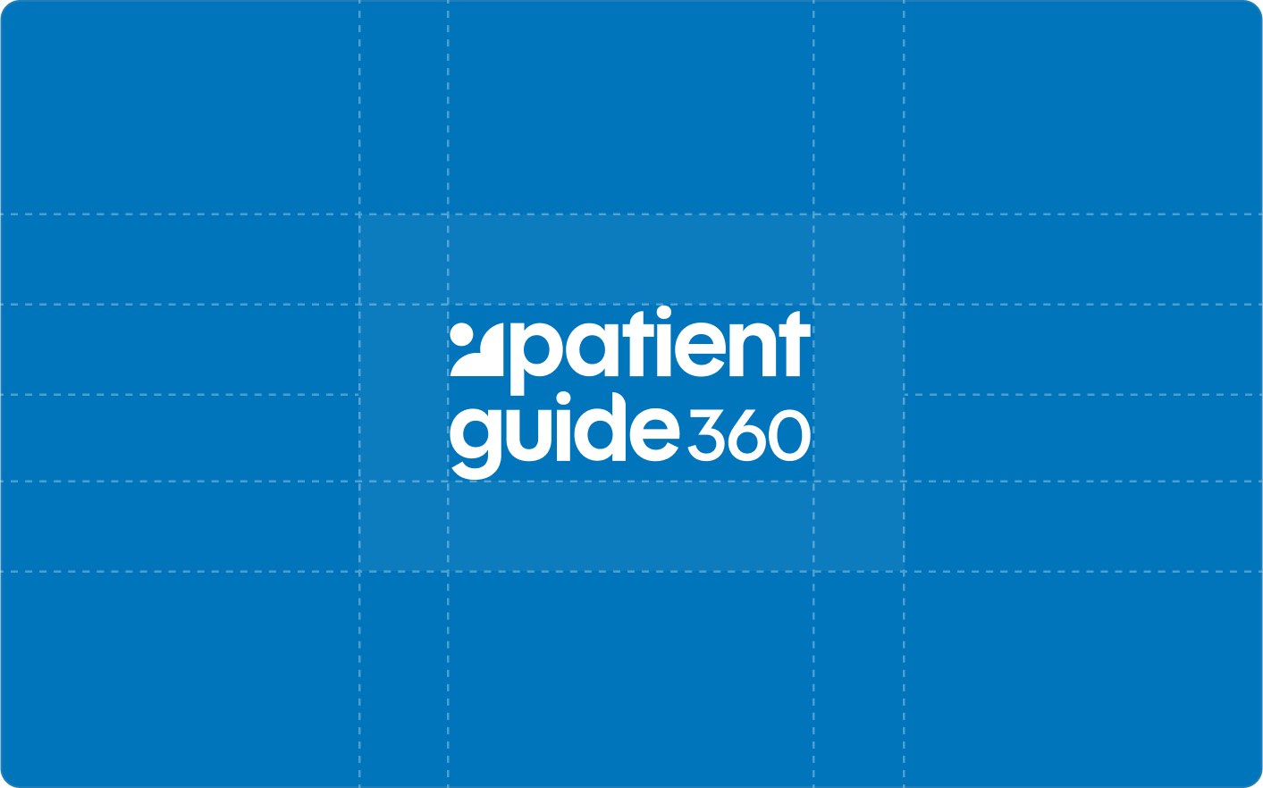
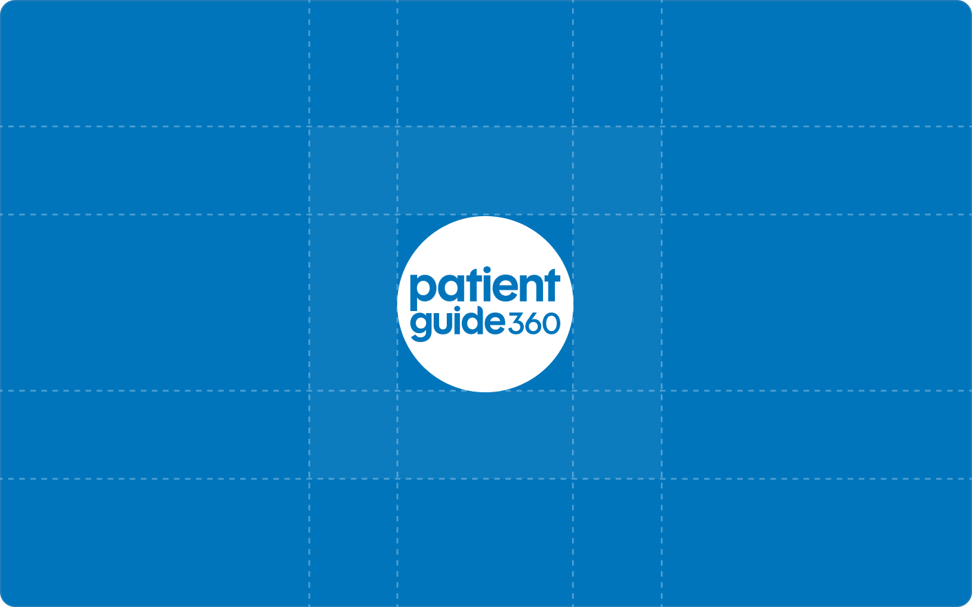
A mark, horizontal and stacked lockups, a circle badge, a tested palette, one typeface and a hand-drawn illustration style, all built from the same rounded geometry.
Logo Mark
Brand audit, naming, creative direction,
visual identity, and brand guidelines
MY ROLE
Brand audit, naming, creative direction,
visual identity, and brand guidelines
SCOPE
Implemented palette and illustration updates.
Proposed PG360 identity and applications.
SCOPE
Implemented palette and illustration updates.
Proposed PG360 identity and applications.
The meaning behind the mark
The PG360 symbol brings together four ideas: the patient, an open book for guidance, a heart for empathy, and a cross for healthcare. I created this animation to reveal those connections, showing how the icon expresses the purpose of the brand through a simple, connected visual language.
Visual identity
A system with room to grow.
Color, typography, illustration, and adaptable logo formats work together to give the brand a consistent voice across channels.
PROJECT
Patient Guide Solutions rebranded to become
Patient Guide 360
MY ROLE
Brand audit, naming, creative direction,
visual identity, and brand guidelines
SCOPE
Implemented palette and illustration updates.
Proposed PG360 identity and applications.
The challenge
A growing company with a brand that stayed small.
Patient Guide Solutions had grown from a singular print product (the patient guide) into a Library of medically specified guides, a digital patient resource library, and a platform for creating hospital branded digital products. The identity hadn't grown with it. The company brand said little about what PGS actually does.
Two audiences, one brand. The people who buy PGS are hospital decision-makers board members, marketing, patient experience. The people who use the product are patients and caregivers. The brand had to earn trust with buyers without losing sight of the patient.
A brand that works in the background. Every guide PGS makes carries the hospital's identity, not its own. So the brand gets only a few moments to be seen: sales conversations, events, email and digital. In each of those, the old identity blended into a sea of generic healthcare logos.
The Patient Guide Solutions brief: Position the brand as a patient-education partner, not a print vendor, with a name and identity that explain the offering, unite the product family and stand out in the few moments the brand gets to be seen.
One Logo, One Direction
The previous identity as it launched: navy and teal throughout, orange call-to-action buttons, and a single thin, horizontal wordmark that had to do every job.
The starting point
A Brand Paid For, But Not Built To Work
Patient Guide Solutions makes custom patient guides and marketing materials for hospitals. When I joined as Creative Director in 2023, the first thing I did was audit the brand – every color, lockup, template and touchpoint the team relied on.
The company had paid an agency for a full brand design the year before. The logo and palette were already on the website, sales decks, signage and merch. It was a big, recent investment, and I was asked not to reopen the logo.
So I focused the audit on something nobody could call a matter of taste: whether the brand actually worked. For a company that sells to hospitals, that meant starting with accessibility.
Identity in motion
The PatientGuide360 mark holds four ideas in a single form. Read it one way and it's a patient; read it the other and it's the guide standing beside them. The same curve is a heart. Rotate it four times around a center and a cross appears. This animation doesn't add anything — it just moves the mark until you can see what was always in it.
Brand Strategy • Visual identity • Brand Guidelines • Creative Direction
A clearer identity for patient education.
I developed Patient Guide 360 as a proposed evolution of Patient Guide Solutions, a clearer name and a flexible identity connected to its sister brand, Baby360. The work brought together naming, logo design, custom illustrations, and brand guidelines, with a responsive website concept showing how the system could translate into a clearer digital experience.
The refreshed color palette was implemented. The complete rebrand was paused due to budget.
My Role
Creative Director, Brand Strategist

The original identity
An established identity with real marketing limits.
The original logo was designed as one horizontal lockup and nothing else. There was no icon, no stacked version, no compact mark. Every application had to fit that one wide, short shape, and most of them couldn't.
1. One logo, one shape, nowhere to go.
Profile images, app icons, favicons and social avatars are square or circular. A long horizontal logo shrinks to an unreadable sliver inside them, or gets cropped until it means nothing. The brand's most visible digital spots — its LinkedIn page, social profiles and team avatars — showed either a tiny strip of text or an awkward fragment. A modern brand needs a suite of lockups. PGS had a single file.
2. A symbol that couldn't stand on its own.
The dotted arc was the only graphic element, and it couldn't be used by itself. At the size it was drawn it was too small and too delicate to hold up, and without the wordmark under it, it was just a curve of dots. It could be a path, a rainbow or a loading bar. Nothing in it pointed to patients or guides, so even at full size it needed explaining.
3. Invisible where it mattered.
The hairline "SOLUTIONS" and tiny dots disappeared on booth banners, merchandise, email signatures and profile images. Those are the places hospital buyers first meet a vendor, and the brand wasn't holding up in any of them.
4. A name that said nothing.
"Solutions" is how most B2B vendors describe themselves. It didn't tell buyers what PGS makes.
5. No room to grow.
With no standalone mark and no system, there was nothing to build a product family on and no visual link to Baby360. Two sister products looked like two unrelated companies.
Brand guidelines Logo Clear Space
-
![]()
01
Discovery Call
-
![]()
02
On-Site Visit
-
![]()
03
Custom Plan
-
![]()
04
Description goes here